Page Widgets
Customizable widget areas on trading, review, and strategy pages that surface page-specific metrics without leaving the view.
Page Widgets
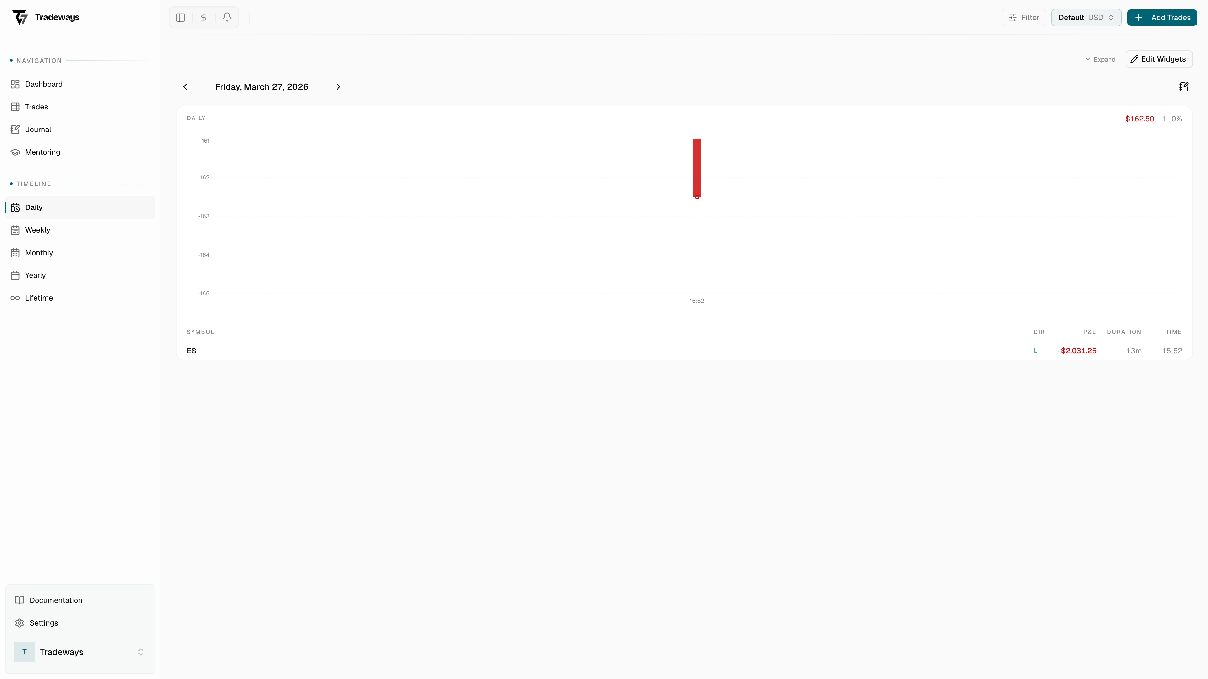
In addition to the fully customizable dashboard, several trading view pages display a compact widget area directly above the main content. This lets you monitor key performance metrics without leaving the page you are working on.
Supported Pages
| Page | Default focus |
|---|---|
| Daily | Day P&L + intraday timing |
| Weekly | Week P&L + weekday split |
| Monthly | Month P&L + daily cadence |
| Yearly | Year P&L + risk ratios |
| Trades | YTD P&L + trade P&L bars |
| Lifetime | Lifetime P&L + risk ratios |
| Review | Review-quality KPIs |
| Strategies | Strategy comparison |
Each page stores its own widget layout independently. Switching trading accounts also switches the widget configuration, so you can have different KPIs for different accounts.
Default Layout
Each supported page starts with its own desktop-first default layout. These defaults are still built from the same widget catalog used on the dashboard, but the mix changes by page so the strip complements the view below it instead of repeating the same KPI set everywhere.
Common examples:
- Daily and Weekly can use a deeper two-row composition when the extra context adds value.
- Monthly and Lifetime stay as flat single-row strips with uniform card heights.
- Trades favors a shorter per-trade P&L chart instead of a tall distribution block.
- Review stays generic and does not depend on a selected strategy.
- Strategies defaults to multi-strategy widgets that work without extra configuration.
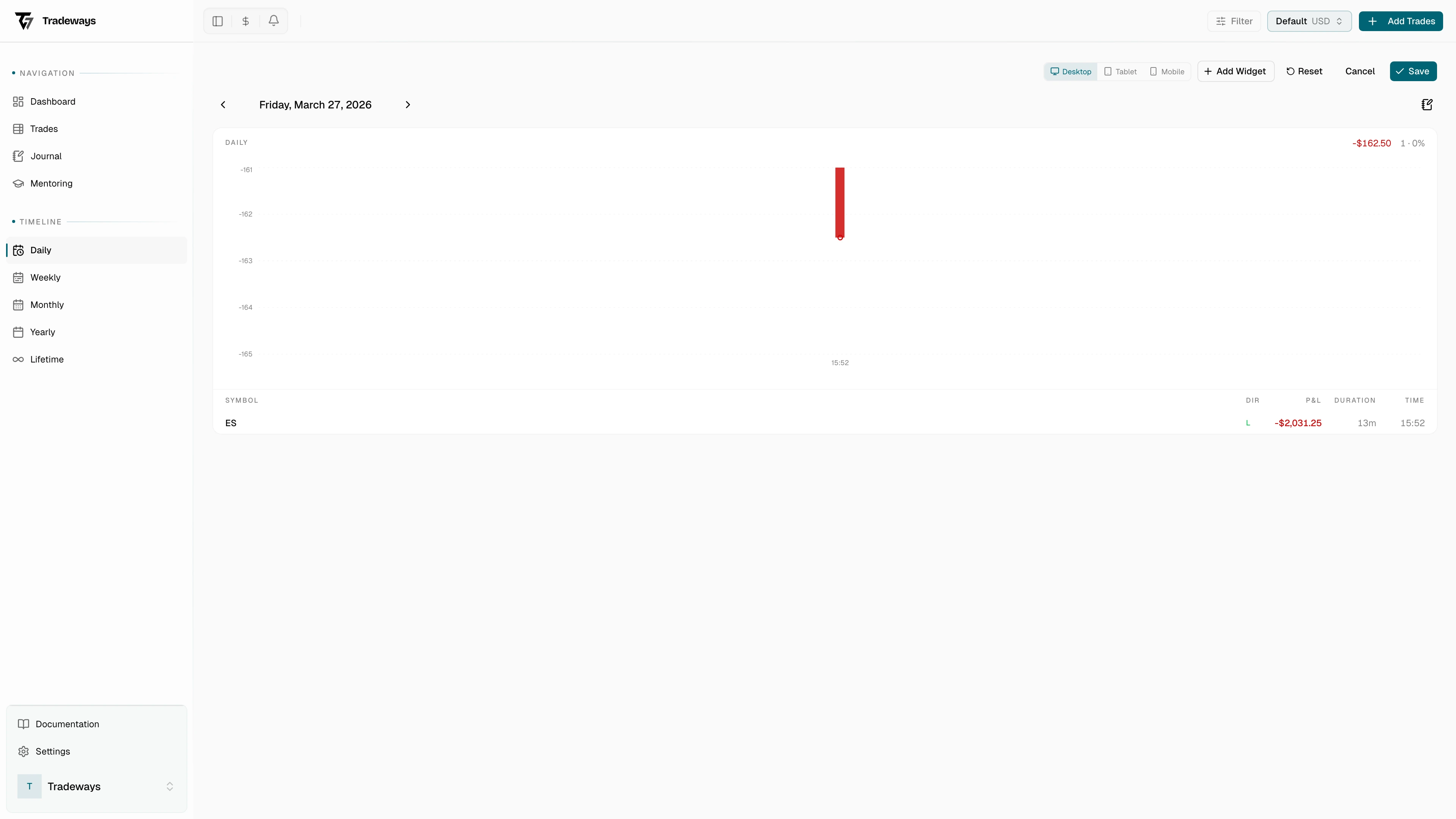
Widget Toolbar
The toolbar appears in the top-right corner of the widget area. It changes depending on whether you are viewing or editing widgets.
View Mode
| Action | Description |
|---|---|
| Collapse | Hide the widget area. Click Expand to show it again. |
| Edit Widgets | Enter edit mode to customize the layout. |
The collapsed/expanded state is remembered per page.
Edit Mode

| Action | Description |
|---|---|
| Add Widget | Open the widget picker to add a new widget. |
| Reset | Restore the default widget layout for this page. A confirmation dialog prevents accidental resets. |
| Cancel | Discard unsaved changes and exit edit mode. |
| Save | Persist the current layout and exit edit mode. |
| Breakpoints | Switch the preview between Desktop, Tablet, and Mobile to see how widgets reflow. |
Adding and Removing Widgets
- Click Edit Widgets to enter edit mode.
- Click Add Widget to open the widget picker. Browse or search the full widget list, quick-add presets, and dynamic entries (your symbols, asset classes, tags).
- Click a widget in the picker to add it to the area.
- To remove a widget, click the remove button on its card while in edit mode.
- Drag widgets to reorder or resize them within the grid.
- Click Save when you are done.
Responsive Behavior
Page widgets use a responsive grid with three breakpoints:
| Breakpoint | Min Width | Grid Columns |
|---|---|---|
| Desktop | 996 px | 12 |
| Tablet | 768 px | 8 |
| Mobile | 480 px | 4 |
Desktop, tablet, and mobile defaults are authored to fit the page: some routes use a single row, while time-based routes can use a deeper two-row composition on desktop and tighter packed layouts on smaller screens. You can customize the layout for each breakpoint independently using the breakpoint preview buttons in the edit toolbar. Each breakpoint stores its own layout so widgets can be arranged optimally at every screen size.
The page widget area uses a maximum of 4 rows to keep the area compact above the main content.
Resetting Widgets
Click Reset in the edit toolbar to restore the page-specific default layout for the current page. A confirmation dialog appears before the reset takes effect. This only affects the current page; other pages keep their layouts.