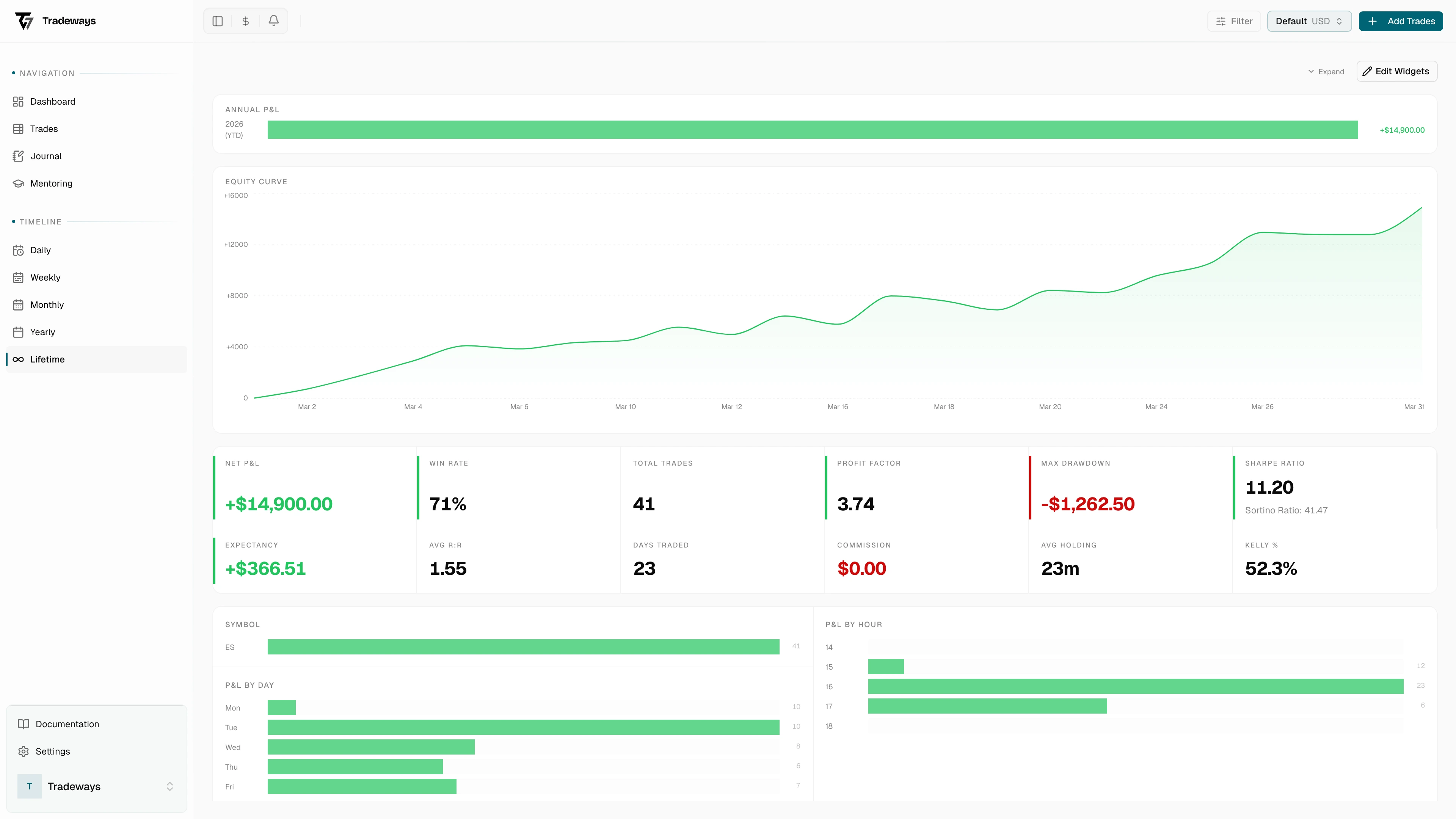
Lifetime View
All-time performance with annual P&L, equity curve, headline stats, and distributions.
Lifetime View
The lifetime view is the wide shot: every trade you've ever logged, on a single page. There's no date navigation here on purpose. The page is the answer to "where do I actually stand?". Switch between currency and percentage at the top.
Open this view when you want a verdict, not a recent-form check. It's where you confirm whether a strategy is paying out over the long run, where you find the year that paid for everything else, and where you check the headline stats you'll quote when someone asks how your trading is going.
Annual P&L
Annual P&L breaks the lifetime curve into years, so the years that built your account stand out next to the ones that tested your patience. Green years are profitable, red years are losing, and the current year is suffixed with YTD. Hover for the exact P&L.
If one year does most of the work, that's worth knowing. Either you've genuinely levelled up since then and the recent flat year is variance, or you got lucky and have been giving it back slowly.
Equity Curve
The equity curve plots cumulative P&L across your entire history. The shape matters more than any single point: a smooth rise with shallow drawdowns means a strategy you can size into, a curve with vertical green stretches and deep red recoveries means you're being paid for risk you may not have signed up for.


Headline stats
Beside the curve sit the lifetime KPIs:
- Net P&L and Total Trades for the raw size of the sample
- Win Rate and Expectancy for whether each trade is worth taking
- Profit Factor and Avg R:R for how winners stack against losers
- Max Drawdown for the worst stretch you've survived
- Sharpe Ratio (with Sortino under it) for risk-adjusted return
- Days Traded, Commission, Avg Holding, Kelly %
The pairs are the point. Win Rate without Avg R:R lies. A 70% win rate at 1:0.5 R:R is the same as a 35% win rate at 1:3. Profit Factor without Max Drawdown lies too: a fund-level 2.0 PF is meaningless if you spent six months underwater to earn it.
Distributions
The distribution charts cut the same P&L four different ways:
- By Symbol: which instruments earn their slot in your watchlist
- By Day: Monday through Sunday, often surprisingly skewed
- By Direction: long vs short
- By Hour: across active trading hours
Each is the same question: is the edge concentrated or spread? Most traders find at least one bar that has no business being there — a symbol that loses on net, a day they should stop trading, a direction they should stop taking. Cutting one of those is usually worth more than adding a new setup.
If you haven't logged any trades yet, the page prompts you to import or add some.
See also
- Yearly view for the most recent full year
- Import to backfill historical trades
- Filter to limit which trades the stats include