Shared Components
How the sidebar, account switcher, event bell, and P&L mode switcher behave across Tradeways.
Shared Components
A few UI elements travel with you on every page: the sidebar, the account switcher, the event bell, and the P&L mode switcher. This page explains what they do beyond what is obvious from looking at them.
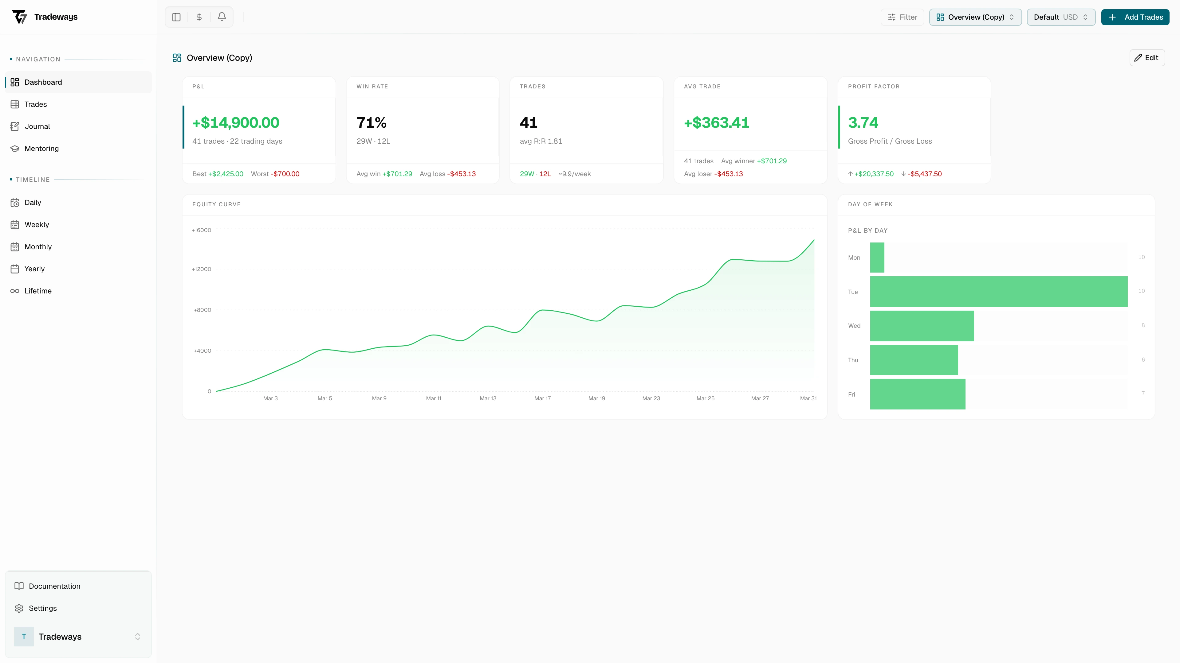
Sidebar
The collapsible sidebar groups links into Navigation (Dashboard, Trades, Journal, Mentoring) and Timeline (Daily, Weekly, Monthly, Yearly, Lifetime). The footer holds Documentation, Settings, and your user menu.
Two behaviors are worth calling out. The Journal link disappears when you do not have journal access. This happens on a mentored account that was shared without journal permissions: you still see the trades, but the journal entry would belong to the account owner.
When you open a mentored account, the avatar block in the footer switches to the student's name with a read-only label, so it is always clear whose account you are looking at.
Account Switcher
The dropdown in the top bar lists your trading accounts and shows the active one with its settlement currency. By default it only lists accounts you have starred as favorites. If nothing is starred, all of your own accounts show up instead. The favorites list is opt-in, not a forced filter.
Mentored accounts you have favorited appear in their own section below your own accounts so that switching contexts is intentional.
Switching accounts keeps you on the same page with the new account selected, with one exception. When you are on a specific dashboard at /dashboard/<ref>, switching redirects you to /dashboard. Custom dashboards are scoped to one account, so the destination would not exist on the new account.
Manage Accounts opens a modal for creating, editing, archiving, and deleting accounts. See Accounts for the full management UI.
Event Bell
The bell in the top bar is a feed of things that happened on your accounts. The badge shows how many entries you have not read yet. Click an entry to jump to the trade, dashboard, or mentoring page it refers to.
Events cover trade lifecycle (imported, created, closed, deleted), uploads (images attached to a trade), account and dashboard changes (created, deleted, archived), and the full mentor workflow: invitations sent and answered, permission changes, accounts shared or revoked, and feedback exchanges in both directions.
Timestamps are relative: "Just now", "5m ago", "2h ago", "3d ago". Hovering an unread entry exposes a checkmark to mark just that one as read; the toolbar action marks the whole list as read at once.
Events are realtime. Anything happening on your accounts shows up without a refresh, including activity from imports running in the background and feedback your mentor or student just sent.
P&L Mode Switcher
The icon next to the account switcher controls how every P&L value in the app is rendered. It is a display setting only; your underlying trade data does not change.
| Mode | Icon | Shows P&L as |
|---|---|---|
| Currency | $ | the account's settlement currency |
| Ticks (1 Lot) | # | ticks normalized to a single standard lot |
| Ticks (Sized) | chart | ticks scaled by the actual position size |
| Percentage | % | a percent of account equity |
The label on the tick modes adapts to the dominant asset class on the active account. Futures show Ticks, forex shows Pips, CFD shows Points, stocks show Cents.
Percentage mode requires a starting balance. The first transaction on the account defines that baseline and is allowed to be zero, but it has to exist. If you have not added one yet, the option is shown with a hint and a link straight to the account settings.
See P&L Display Modes for the conversion math and where each mode is honored versus where currency values are forced (for example, cross-currency aggregations).
Form Controls
A few inputs appear in more than one place. Their behavior is the same everywhere they show up.
The currency select lists ISO 4217 currency codes. It has a compact variant (code only, e.g. "USD") used in tight UI and a detailed variant (code, symbol, and name, e.g. "USD $, US Dollar") used in settings forms. Decimal handling is currency-aware: JPY shows no decimals, BHD shows three, most show two.
The date picker is a popover calendar with month and year dropdowns for fast jumps. It accepts an explicit earliest and latest selectable month so trade entry forms cannot point at dates before your account exists.
The instrument form is shared between the Instruments page and the import flow. The fields shown depend on the asset class. Futures, forex, and CFD work in ticks (Tick Size, Point Value, P&L Currency, plus Exchange for futures). Stocks and crypto work in account currency (Contract Multiplier, Lot Size, P&L Currency). For forex and crypto pairs the P&L currency is derived from the symbol, so EURUSD resolves to USD. A warning shows up when the instrument's P&L currency differs from the account's settlement currency, since that means every trade on it will go through an FX conversion.
The segment toggle is the row of buttons used for mode switches, view toggles, and quick filter selectors throughout the app. It always shows the selected option highlighted and supports keyboard navigation.
Asset Class Badge
A small outlined pill that labels an instrument by asset class: Futures, Forex, Stocks, Crypto, or CFD. You see it in trade lists, instrument configuration, and trade detail. The label is localized; the asset class set is fixed and shared between import, P&L calculation, and display.
Save Status
The journal editor and a few other auto-saving forms show a colored dot with a label so you always know whether your work is persisted:
| Status | Dot | Label |
|---|---|---|
| No note yet | gray | No note |
| Saved | green | Saved |
| Being created | blue (pulse) | Creating… |
| Unsaved changes | amber | Unsaved changes |
| Saving | blue (pulse) | Saving… |
If the indicator stays amber for more than a few seconds while you are not typing, the save failed, usually a connectivity issue. The next keystroke or a page reload triggers another attempt.